Graphic design: 6 fonts that aren't as cool as you think
The right font can do wonders for your brand identity. Discover 6 overused typefaces you might want to avoid.

In 2012, scientists at CERN in Geneva had a discovery to share – a discovery that would reshape our understanding of particle physics. A discovery that could – and would – shake the world.
The world, however, shook its massive head when it saw the font CERN had chosen to present its findings. This monumental moment was presented in none other than
Comic Sans.
Here at My Digital Hero, we specialise in helping brands increase their online visibility. So, why are we going on about a peculiar moment in particle physics?
The answer is that this story captures something about fonts and how to use them – something that every small business would do well to think about.
You see, Comic Sans divides opinion. Some people think it's childish, cartoonish and garish. It's the font they love to hate. Others, however, think it's fun, legible and exuberant. Still others use it to improve internet accessibility for
people with dyslexia.
In other words, it's all about context. CERN may not be the place for Comic Sans. But a small business selling toys could probably get away with it.
So, while we believe there are no good or bad fonts, we
do
believe there are good and bad uses of them. And all too often, we see small businesses choose fonts that poorly communicate their brand.
Sometimes, it's a case of using a font that
everybody uses. Other times, it's using one that clashes with your messaging. Sometimes, it's just picking the first one on the drop-down menu.
To this, we say: "Fie!" and "No more!" Pretty much every business in the big leagues has a signature font – why don't you?
To get you started, here are six fonts that we think are a bit less cool than their reputations suggest…
1. Times New Roman
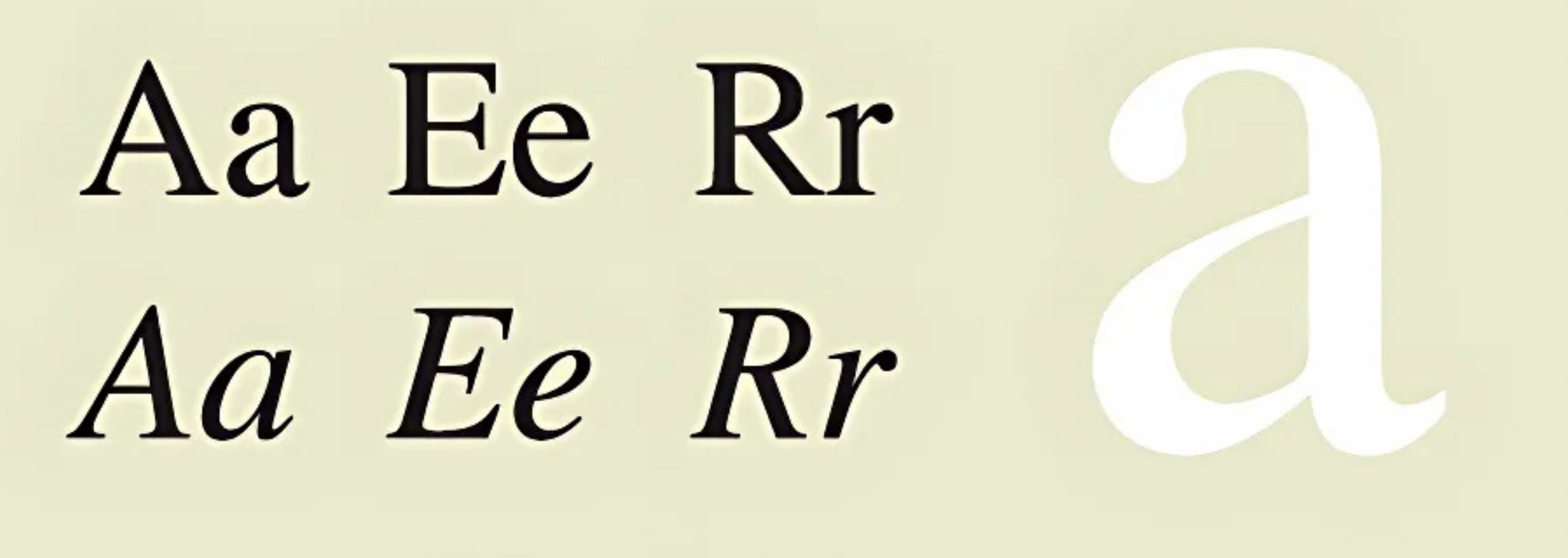
In our opinion, Times New Roman is a classic case of overuse. And with good reason: this elegant typeface is easy to scale and easy on the eye.
But! There are days in the digital marketing world when it feels like you can't move without hitting a wall of Times New Roman. These days, it doesn't look effortlessly stylish. It looks low-effortfully
fine. Is that really the message you want to send to potential customers?
2. Courier
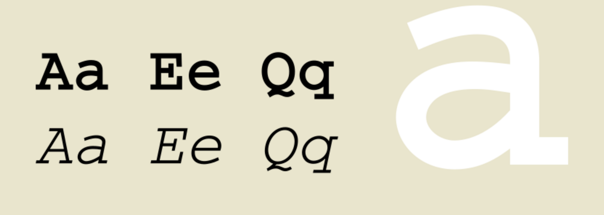
Courier has a reputation for legibility thanks to its extensive use in computer programming and film scripts. But to us, there's a reason why the US State Department switched its house font from Courier to Times New Roman on grounds of legibility.
In our opinion, Courier puts style above function. Restaurants and taprooms use it for a touch of retro typewritten flair. Surely this eatery is haunted by the shades of poets and philosophers past? Or is it just a stylistic cliche?
The thing is that Courier isn't as easy to read as people seem to think. And when you're trying to get your brand identity across, legibility is non-negotiable.
3. Helvetica
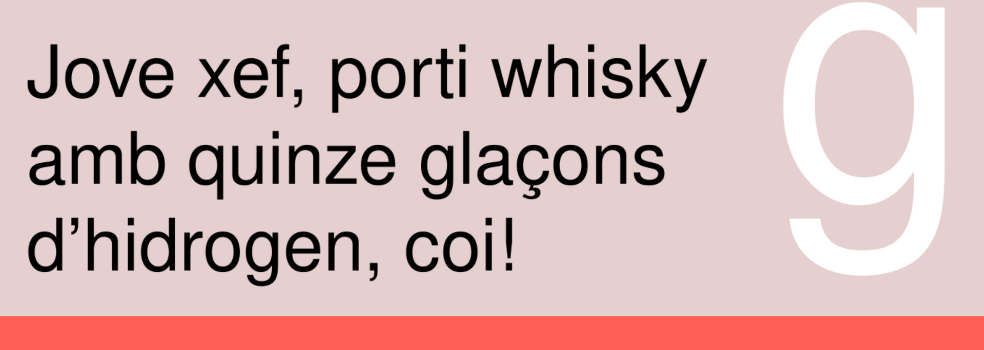
Helvetica is nothing if not versatile. Opening a small modern art gallery? Helvetica will give it a whiff of the continent. Need a simple yet effective font for a government department? Helvetica has just the right combination of elegance and blandness to make it work.
But this versatility is Helvetica's downfall. Nine times out of 10, it's a poor choice for digital marketing because it lacks a strong identity – and if you're anything like our clients, that's not something we'd say about you.
4. Trajan
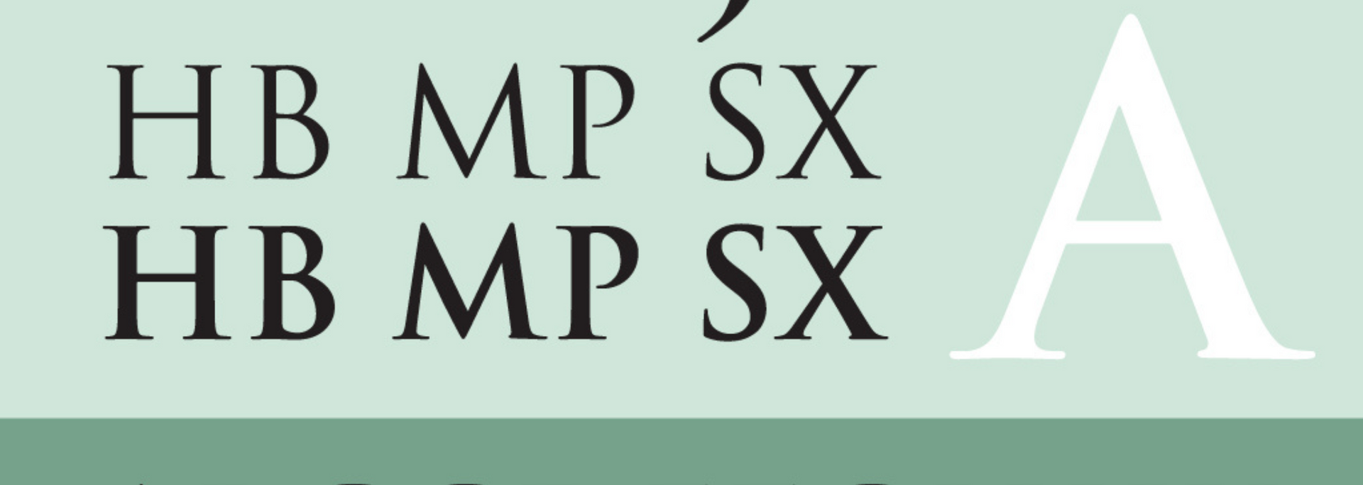
Even if you don't know this font by name, you'll have seen it on film posters. This all-caps font, based on the typeface at the base of Trajan's Column in Rome, has an undeniable air of pomp and ceremony.
But like the other fonts on our list, it's a definite victim of overuse. If you want to inject a bit of Roman grandeur into your brand, there are at least MMXXXXIII alternatives to consider. Don't be like Spartacus – stand out from the crowd!
5. Copperplate Gothic
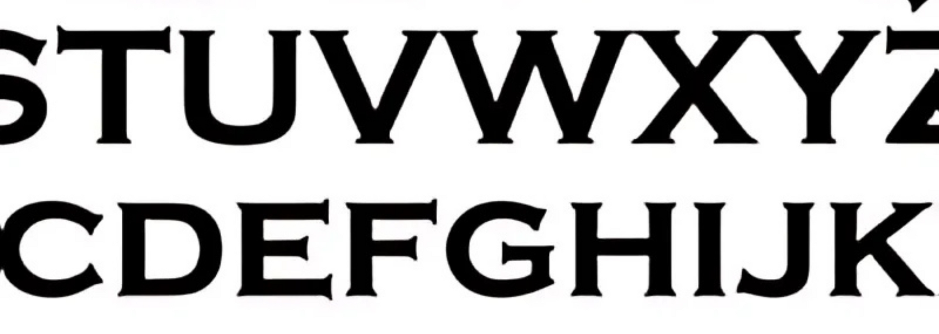
If you've ever searched online for a local law firm or accountancy agency, you've probably seen Copperplate Gothic in the wild. And if you've ever paid them a visit, you've probably seen this familiar font acid-etched onto the door.
Copperplate Gothic says "professionalism". It says "business cards". In the wrong hands, it says, um, "lack of fresh ideas".
Again, you want to stand out in a crowded field. Copperplate Gothic is a go-to that often goes nowhere. In our opinion, it's best avoided.
6. Impact
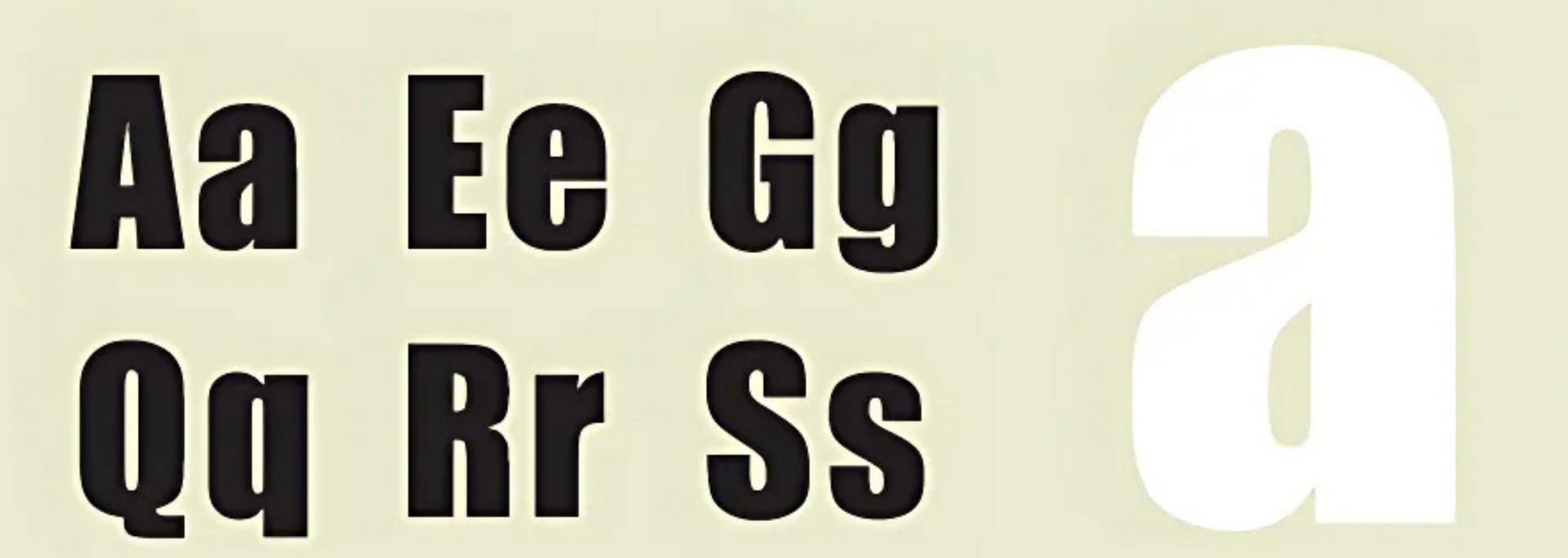
"Hmmm," say small businesses up and down the land. "How can we make sure our logo makes an impact?" Answer: "Maybe Impact?"
Don't get us wrong: it's a good font – bold, legible and even striking. But how can you make an impact when you're using the same font as your competitors?
How to find the right font
By now, you might be wondering whether we've got anything nice to say or are happy to sit on the sidelines trashing typographical turkeys.
In fact, we want more than anything to see brands realise their potential. That's why we choose fonts for our own clients with care. Graphic design is too important to be taken lightly!
So, if you're after some original fonts, there are a number of routes you can take. You can follow Instagram and Pinterest accounts for inspiration. You can use Adobe's "Find fonts from images" tool.
You can take a screenshot of a font you think is cool and drop it into WhatTheFont Font Finder. You can watch YouTube videos, read Reddit threads. You could even take out some library books!
You could also consider working with a digital marketing agency like ours. We work closely with our clients to create a brand identity that plays to their strengths. Fonts are just one part of this – but an undeniably important one.
You want a website that tells
your story – not everyone else's.
Work with My Digital Hero and we'll help you forge a brand identity that's impossible to ignore. We look forward to talking you through your options.

