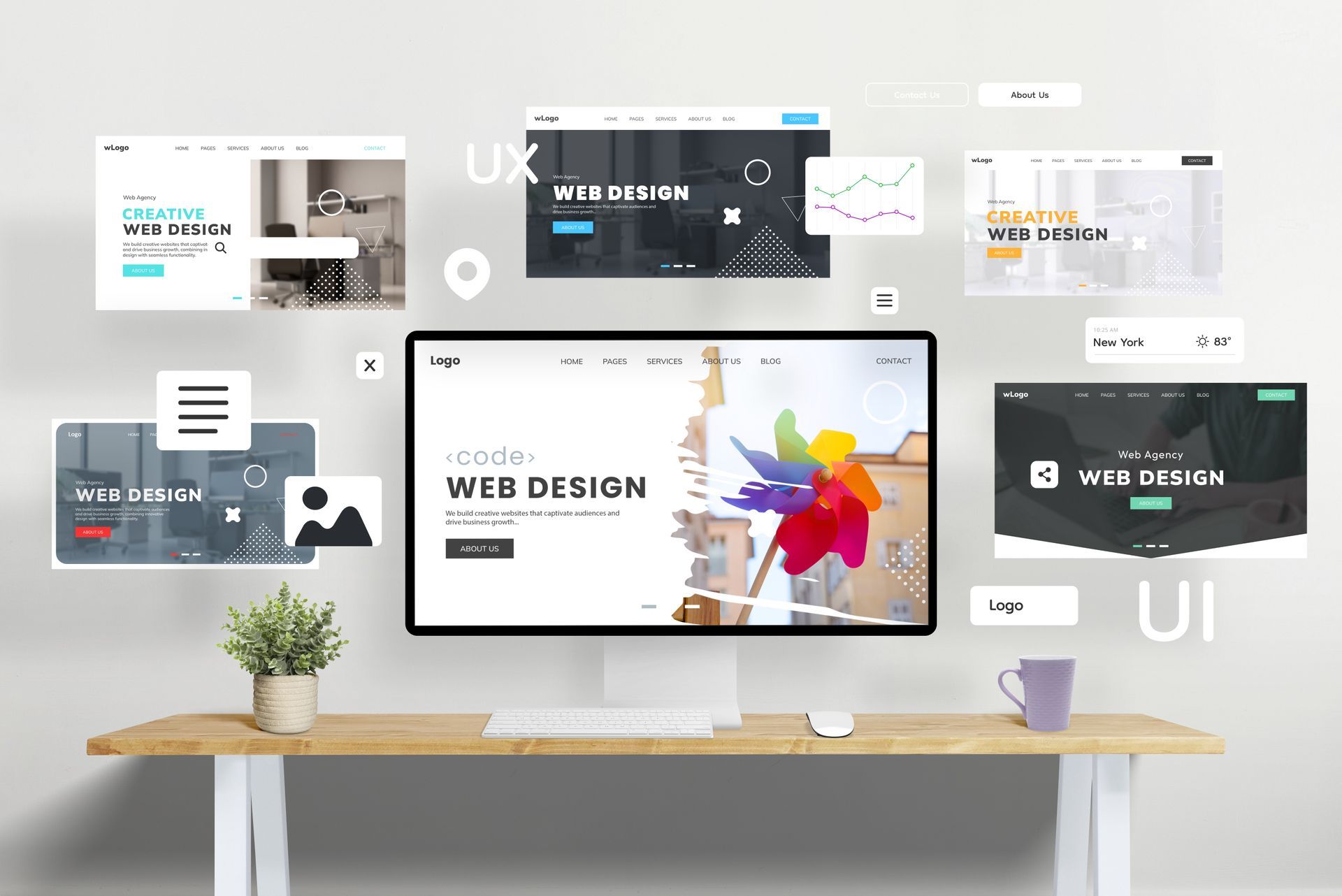
User First: 7 Website Usability Best Practices to Increase Engagement
Discover 7 website usability best practices, quick wins and testing tips to increase engagement, dwell time and conversions.
Putting people before pixels
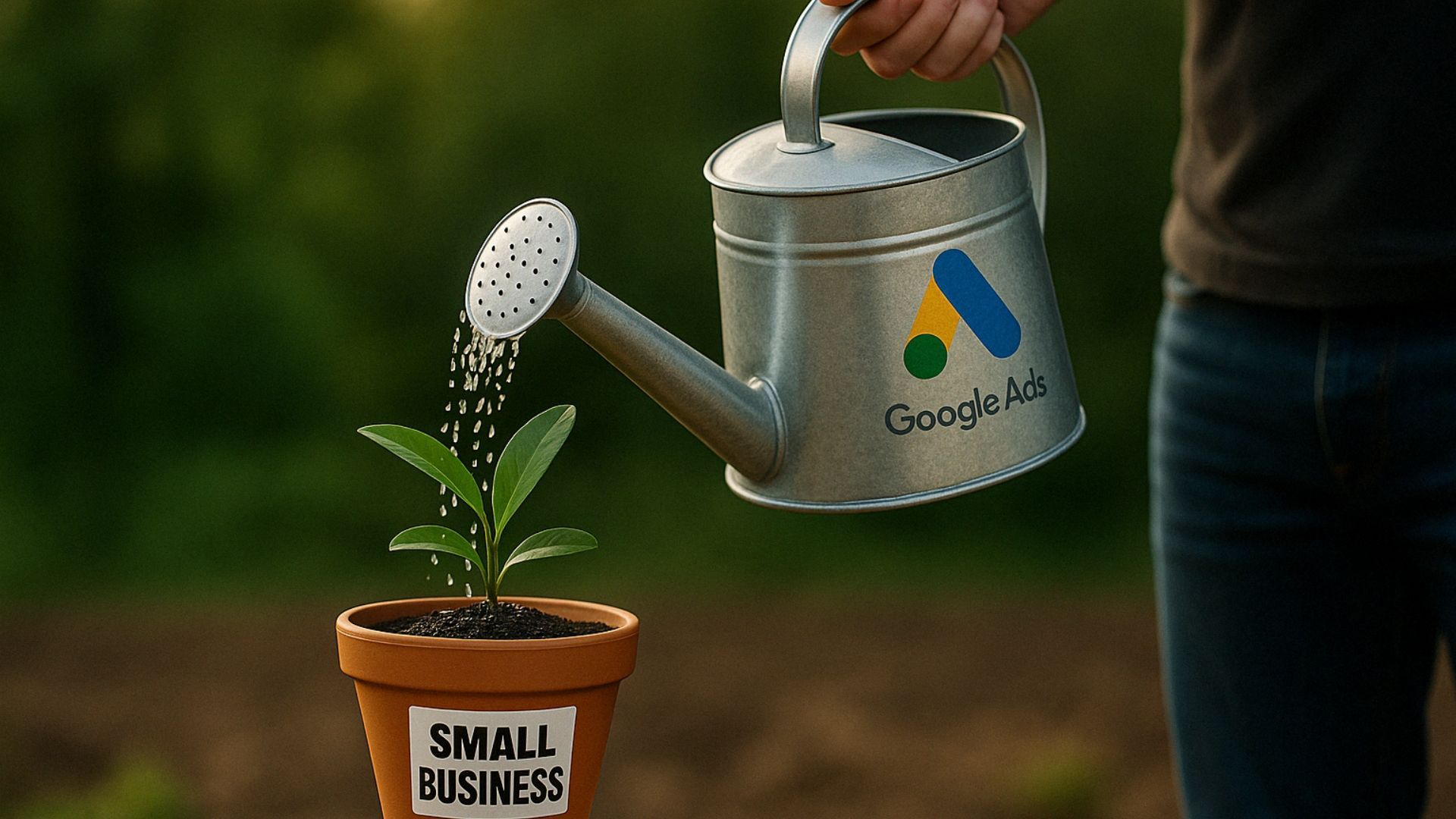
You can pour thousands into Google Ads, stuff your pages with the choicest keywords and fire newsletters at inboxes like confetti at a June wedding – but if visitors land on a clunky site, they’ll bounce faster than you can say “404”.
That’s why website usability best practices belong at the very top of your digital to‑do list. Nail them and you’ll enjoy longer sessions, lower bounce rates and a steady flow of enquiries. Ignore them and, well, even Batman will struggle to save your conversion stats.
Below are seven field‑tested tactics – a mixture of website usability quick wins and longer‑term strategies – to turn casual clickers into engaged superfans.
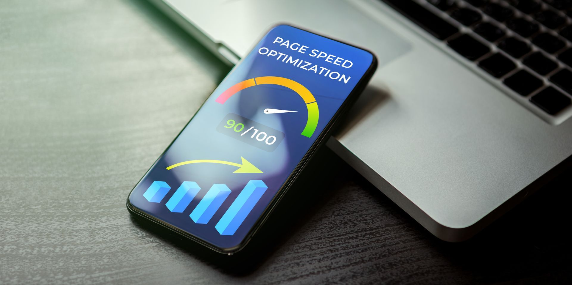
1. Speed is your super‑power
Why it matters
Every additional second of load time can slash conversions by up to 20 %. People expect pages to appear quicker than a cuppa in a builder’s mug; keep them waiting and they’ll hoof it back to Google.
Quick wins
- Compress images – modern formats (WebP/AVIF) can halve file size without the potato‑quality fuzz.
- Cache like you mean it – server‑side caching and a sensible CDN mean repeated visits feel instant.
- Trim the bloat – axe unused plug‑ins, minify CSS/JS, and politely show the exit to that 7‑MB hero video autoplaying above the fold.
Hero tip: Our Website Audit tool benchmarks load speed in seconds, not minutes. It’s free – and marginally less painful than yet another page‑speed lecture from the dev team.

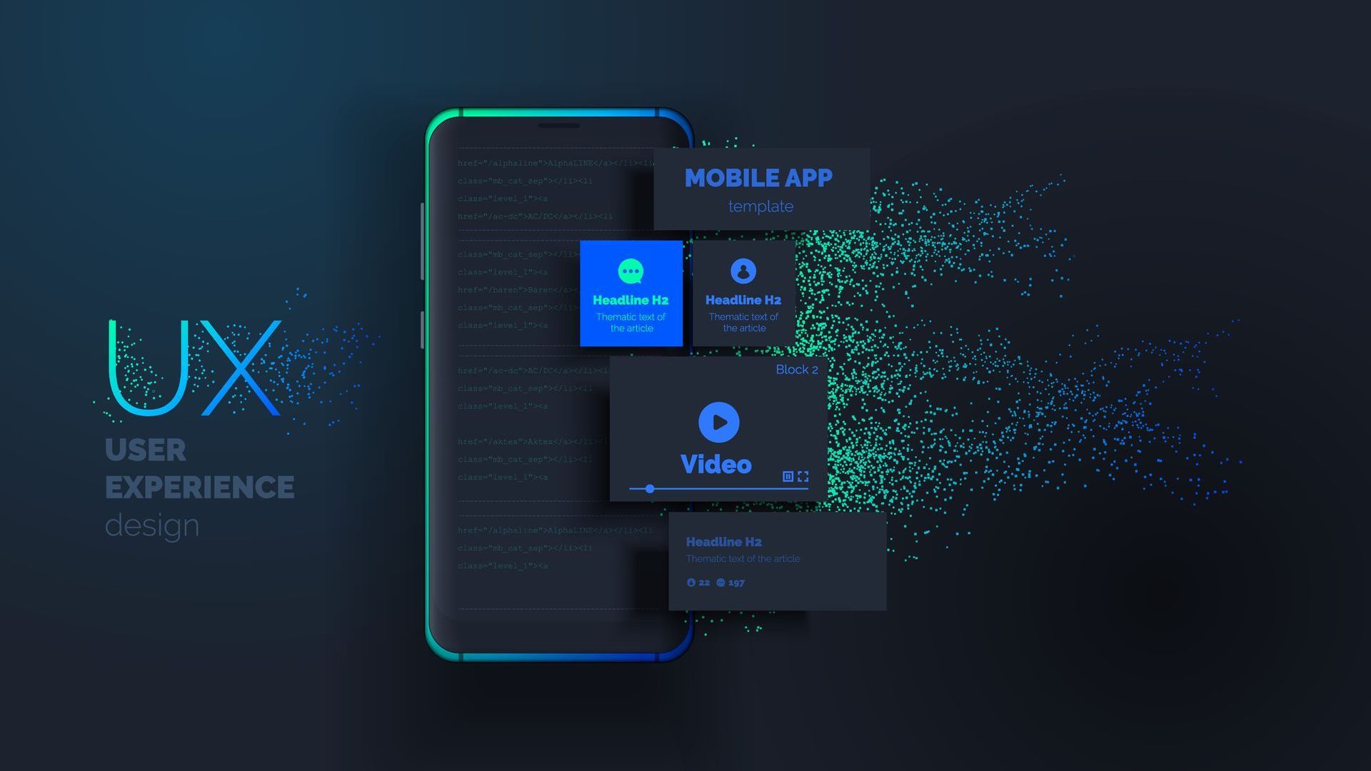
2. Mobile‑first, not mobile‑last
Google’s been indexing mobile versions first since 2019. Yet we still see gorgeous desktop layouts that transform into finger‑pinch nightmares on phones.
- Stick to a single‑column layout under 768 px.
- Use at least 16 px body text, 44 px tappable targets.
- Stop hiding vital content behind tiny hamburger menus – nobody likes a treasure hunt.
These tweaks aren’t glam, but they’re usability best practices for higher dwell time on the small screen, where over 60 % of browsing now happens.
3. Navigation: show, don’t maze
Ever wandered into an Ikea, lost your bearings and wondered if you’ll see daylight again? That’s how users feel inside labyrinthine menus.
- Keep primary nav to 5–7 items; anything more, pop into a “More” dropdown or the footer.
- Breadcrumbs help visitors backtrack without the browser’s back button.
- Label things plainly: “Pricing” trumps “Money Matters”. Wit is welcome, but clarity pays the bills.
4. Above‑the‑fold clarity
First impressions form in 50 milliseconds – roughly the time it takes to register that the hero image is, in fact, a stock photo of two professionals laughing at salad.
Above the fold, answer three questions:
- What is this? – your H1.
- Why should I care? – a sharp, benefit‑led sub‑heading.
- What now? – a single, contrasting call‑to‑action button.
Users decide whether to scroll based on this snippet alone. Get it right and watch engagement soar.
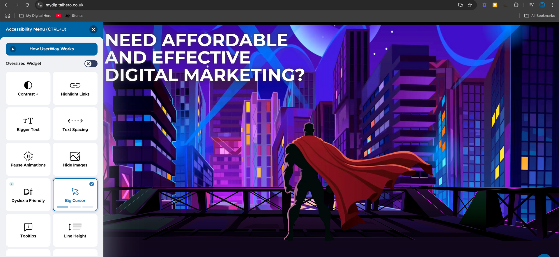
5. Accessibility: heroics for every visitor
Fourteen per cent of UK adults live with some form of disability. Accessibility isn’t a favour – it’s the law (WCAG 2.2, anyone?) and fantastic for SEO.
- Maintain a 4.5:1 colour contrast ratio for text.
- Use clear focus indicators so keyboard users can see where they are.
- Alt‑text isn’t just for Google Images; it’s for those using screen‑readers, too.
Accessible design doesn’t dilute creativity; it sharpens it. Inclusive sites keep visitors around longer – another tick in the “higher dwell time” column. Have a play with UserWay, our method for keeping all our client websites compliant and easy to navigate for those with a disability. Just click the icon in the bottom left corner of the screen.

6. Microcopy that guides (and sells)
Those little snippets of text – button labels, form hints, error messages – do heavy lifting for usability. They reassure, clarify and nudge.
- Swap “Submit” for “Get my free quote”, “Sign up” for “Start my 14‑day trial”.
- Turn error messages into helpful detours: “Password too short – use 8+ characters and a heroic symbol ⚡.”
- In forms, explain why you need info (“We’ll only use your number to confirm your booking – scouts’ honour”).
Small words; mighty impact on conversions.

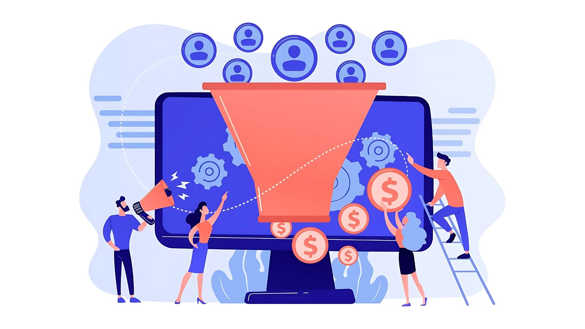
7. Test, measure, refine
Even the Hulk wouldn’t rely on hunches alone. That’s why usability testing for higher conversions is our final (and most important) practice.
Guerilla usability tests
Grab five real users – a mate, your mum, Barry from Accounts – and watch them complete key tasks. You’ll spot sticking points within minutes.
Analytics deep dive
Heat‑maps and session replays reveal rage clicks and dead ends. If users bounce on step two of your checkout, you know where to wield the UX chainsaw.
A/B experiments
Change one element at a time: heading, hero image, CTA colour. Measure. Keep the winner. Repeat.
Continuous testing transforms website usability quick wins into sustained revenue growth – and it’s the only way to prove those tweaks equal pounds, not just prettier wireframes.

Bringing it all together
Great usability is invisible: pages load before you blink, buttons sit exactly where you expect, and the journey from homepage to “Thanks for your order” feels friction‑free. Get these seven practices right and you’ll enjoy:
- Longer sessions and higher dwell time
- More conversions at a lower cost per acquisition
- Happier humans who’ll recommend you faster than you can say “nice UX”
Need a hand turning theory into tangible results? Our Website Design service bakes every best practice into sites that look sharp and sell harder. Or run your current site through our free audit for a personalised punch‑list of improvements.
Ready to level‑up your website?
Book a discovery call and our heroes will map out your next quick win – cape, caffeine and conversion rates at the ready.