When bad graphic design makes good
Sometimes, apparently bad graphic design can work in a brand's favour. Explore 6 of the oddest examples.

In the movie world, there's a class of films known as "so bad it's good" movies. These are movies that died a death financially and critically yet found a cult audience over the years.
In graphic design, there's a related but separate phenomenon. This is when bad design leads to good results, either straight away or over time.
Sometimes, a conventionally bad design will stand out from a thousand and one generic competitors. It's a risky strategy that can easily backfire. But when the bad design reflects the individuality of the brand, it can reap dividends.
Here at My Digital Hero, we only make good graphic design (though we say so ourselves!) But what we have in common with the following six examples of bad design is that our work always reflects your brand identity.
So, without further ado, here are six times bad graphic design made a splash.
1. LINGsCARS
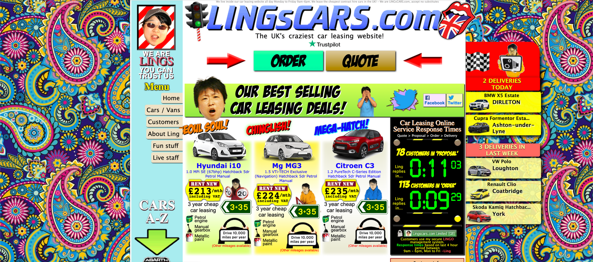
Ling's Cars – stylised as LINGsCARS – is a car dealership based in Newcastle, England. It was founded by Chinese businesswoman Ling Valentine and her husband Jon in 2000.
Within six years, the couple had gone from leasing cars from their living room to making a million a month in sales. Their secret? It wasn't just the service itself – it was the wacky website they used to promote it.
The original site, now scrubbed from the web, has been called "the weirdest website on the internet". Not content with images of cars and text about the company's services, LINGsCARS treated visitors to a firework display of karaoke, online games and extravagant fonts.
It was a canny move that fulfilled Ling's desire, expressed in a 2014 interview, to "stand out in a sea of 'same again' car leasing websites". The results speak for themselves.
2. Taco Bell's 2016 logo redesign

American fast-food restaurant Taco Bell has had many logos since it was founded in 1962. And since 1984, they've all featured its iconic bell.
In 2016, however, Taco Bell decided to launch a revamped version at the same time as its flagship Las Vegas restaurant.
In many people's eyes, the new design was offensively bland. The bold, vibrant colours of previous iterations had been replaced by a single colour and the font made blocky and generic. Sure, it had its supporters – but overall, it went down like a bad burrito.
Did it matter? Heck no. As of 2023, Taco Bell serves more than 2 billion customers a year – more than the population of India. Sometimes, it seems, no-frills design can work wonders for a brand.
3. MailChimp
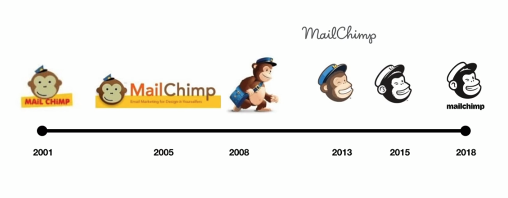
In the digital marketing world, it's widely accepted that businesses should think hard about their graphic design. At My Digital Hero, it's one of our top priorities. But in the case of MailChimp, a tossed-off design helped push the company into the big leagues.
Despite having a background in design, MailChimp's CEO Ben Chestnut spent next to no time on the website's first iteration in 2001.
"Most of everything you see in this version of the website," he said, "was spare parts from previous web design projects. One of the failed side projects we worked on was an e-greeting site, and one of the most popular greetings was a monkey. So, when we needed a logo for MailChimp, I just pulled the monkey out of the parts bin from that project and put a hat on him."
Most companies would have tried to persuade Chestnut to have another go. But he stuck with it, and the basic yet quirky design helped MailChimp carve out a distinctive brand identity.
4. Dollar Shave Club
Most brands strive to be perceived as a safe pair of hands. Sure, your rocking chair factory isn't rocking the world – but if you want a well-made rocking chair with a fast turnaround, it's just the thing.
Some brands, however, are disruptive. Take Dollar Shave Club, the subscription service that delivers cheap razors to men and women across the world.
It all began when founders Mark Levine and Michael Dubin met at a party and bonded over their hatred of razor blade prices.
The company's desire to disrupt the razor market was reflected in its 2012 viral ad. Its low-budget visuals, rough editing and almost punk-like aesthetic perfectly communicated the company's desire to be different.
Since then, the company has rebranded, becoming an altogether slicker – some would say blander – affair. But its initial success is undeniably down to those early rough-and-ready ads.
5. I Love New York

Since 1977, the "I Love New York" logo has been used to promote tourism in the state of New York.
You've probably seen it: "I" and "NY" in a typewriter-style font with a red heart in the middle. Yet despite its ubiquity, the logo had humble origins.
Graphic designer Milton Glaser made the design in 1976 in the back of a taxi. His materials? A red crayon and a piece of scrap paper. He didn't think the campaign would last and provided his services
pro bono.
Fifty years later and this logo is as American as baseball and apple pie. Sometimes, it seems, simplicity is best.
6. Steely Dan's
The Royal Scam
album cover

In 1976, yacht-rock legends Steely Dan released their fifth studio album, the spikily titled The Royal Scam.
It came with an album cover that its own creators called "the most hideous album cover of the 70s, bar none".
Your tastes may vary, but many people would agree. Its depiction of a businessman lying on a bench surrounded by grotesque, animal-headed skyscrapers is, shall we say, an acquired taste.
Despite its notoriously bad cover,
The Royal Scam
is a firm fan favourite and was voted number 868 in the third edition of Colin Larkin's
All Time Top 1000 Albums.
Looking for graphic design services that reflect your business's unique personality?
Get in touch with My Digital Hero to discuss how we can make good on your brand promises – no bad design stunts necessary.